Abbott.com Redesign
July 2013 - October 2014
SapientNitro
http://www.abbott.com/
Role
Information Architect, UI/UX, UX Researcher
Challenge
This was a compete overall site overhaul on all of Abbott's global sites to introduce the new Abbott brand and become a consumer-facing responsive website. Starting with United States, we interviewed key stakeholders at the company and learned of key business needs. Interweaving the business needs and requirements with the brand needs, we created a site that introduces Abbott to the consumer. As a global site, the templates had to be flexible to accommodate different content and languages. Furthermore, content and business needs are evolving so new layouts and components need to be developed. As the main Experience Designer on the team, I am in charge of working with the visual designers, developers and content strategy to create the site architecture and navigation and to communicate and educate the client on the site strategy.
Results
We created global templates that have been implemented in three sites - US, Brazil and India - and will be furthered implemented across the globe. We focused on a visual experience that gives a user an immediate sense of the new Abbott. Horizontal navigation allowed users to quickly access other sections. Knowing this would be a new site to all, we created different navigational tools to aid in the exploration of the site. As the purpose of the website is to inform, we created long-form storytelling templates. The site is completely device agnostic allowing a seamless experience.
Tools
We primarily used inDesign for the wireframes, templates and site map. Axure was used for prototyping. All presentations to the client was done in PowerPoint.
Affordable Portables' Redesigned Website
January - March 2013
HCI 454 - Interaction Design & Information Architecture
Role
UX Researcher & Designer, Information Architect
Challenge
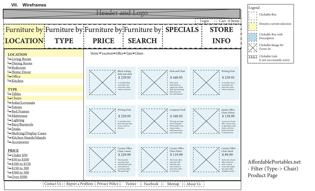
The main goal of this project was to find a website that had some user experience flaws, identify those issues and redesign the website to focus on user needs and goals. Our team of three first needed to discover the main user issues and challenges on Affordable Portables' website. Once discovering that the whole site negates almost all design patterns and principles, our scope of the project consisted of the entire website minus the shopping cart experience (which was run on an external site). We wanted to create a website that users can easily navigate through to search and find products. We tackled the problem in three parts. The first part was the discovery stage. We took an inventory audit of the site, noting all content type within the site along with the organizational issues, and then created a mind map that helped to illustrate the underlying concepts and goals that drive the user through the site. The second step was to run an open card sort with nine individuals to get a better sense of categorization and grouping of the products. The third step was taking the research and discovery we did earlier to redesign (through templates, wireframes and content modules) the website catering to the user's needs.
Results
Through the three steps, we discovered that users needed and expected top-level navigation, a wide variety of categorization for the products and filters throughout the site to aid the user in finding and retrieving products. Primary navigation was set up as a filter to immediately help the user make the site's overwhelming inventory (hundreds of products) more manageable. The left-side filter menu was designed to appear on all pages after the home page and keeps other filters clickable to maximize browsing versatility.
Tools
We primarily used inDesign for the wireframes, templates and modules. The site map was done in Visio. The presentation was done in PowerPoint.
HCI 454 - Interaction Design & Information Architecture
Role
UX Researcher & Designer, Information Architect
Challenge
The main goal of this project was to find a website that had some user experience flaws, identify those issues and redesign the website to focus on user needs and goals. Our team of three first needed to discover the main user issues and challenges on Affordable Portables' website. Once discovering that the whole site negates almost all design patterns and principles, our scope of the project consisted of the entire website minus the shopping cart experience (which was run on an external site). We wanted to create a website that users can easily navigate through to search and find products. We tackled the problem in three parts. The first part was the discovery stage. We took an inventory audit of the site, noting all content type within the site along with the organizational issues, and then created a mind map that helped to illustrate the underlying concepts and goals that drive the user through the site. The second step was to run an open card sort with nine individuals to get a better sense of categorization and grouping of the products. The third step was taking the research and discovery we did earlier to redesign (through templates, wireframes and content modules) the website catering to the user's needs.
Results
Through the three steps, we discovered that users needed and expected top-level navigation, a wide variety of categorization for the products and filters throughout the site to aid the user in finding and retrieving products. Primary navigation was set up as a filter to immediately help the user make the site's overwhelming inventory (hundreds of products) more manageable. The left-side filter menu was designed to appear on all pages after the home page and keeps other filters clickable to maximize browsing versatility.
Tools
We primarily used inDesign for the wireframes, templates and modules. The site map was done in Visio. The presentation was done in PowerPoint.
Report
|
Wireframes_Templates
|
Card Sort
| ||||||
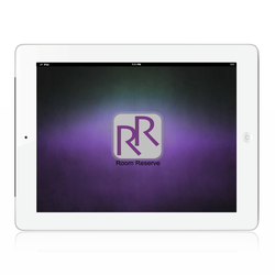
RoomReserve Application
March 2013
HCI 470 - Digital Page Formatting
Role
UX Researcher & Designer
Challenge
The main goal was to design and create a hi-fidelity prototype of an application that can be viewed on a tablet that follows the principles and patterns of design, along with aligning to the user's needs and expectations for this application.
Results
Since the application could be anything, we (a team of three people) came up with a conference booking application. With some brief competitive analysis and a survey of users, we found the user needs for this application - the need for the application to be accessible anywhere and the need for the application to be efficient (minimal steps to complete) and have a low level of learnability (the user can figure out the app during the first use). Our first step was research, by looking at competitive applications and an informal user survey of user experience. Using that research, we created wireframes for the prototype. Since this project had to be completed in a short deadline, we simultaneously created the prototype with the report. The prototype is the first version of the room booking application. The report goes into detail about the research and theory behind the application.
Tools
Keynote was used to create the hi-fidelity prototype. The report was created in inDesign, as were the wireframes.
Prototype
|
RoomReserve Report
|
Wireframes
| ||||||
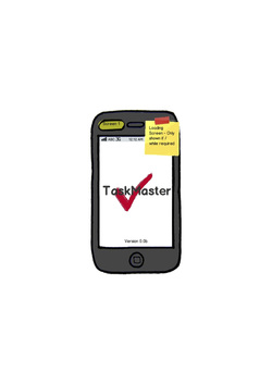
Task Management Application
June - August 2012
HCI 440 - Introduction to User-Centered Design
Role
UX Researcher & Designer
Challenge
The main was to design and create a lo-fidelity prototype of a task management application that can be viewed on a mobile phone. We wanted to create an application that was easy to use and intuitive, something that a non-expert could use for both personal and professional task management.
Results
TaskMaster was heavily influenced by task scenarios, target user interviews and requirements (all explained in detail in the report below). In discovering the problem statement and creating personas, our group of four came up with almost thirty interview questions. After interviewing target users, we incorporated the personas and interview results to create two task scenarios. These task scenarios helped us to create fourteen requirements for the prototype. With the research and requirements completed, we created a task management application, TaskMaster, that fulfilled the user's needs.
Tools
Balsamiq was used to create the lo-fidelity prototype. The reports were created in Word.
Prototype
Report
| |||
